
Report - Embedding Analysis
LightlyOne offers an analysis of the distribution of your input and selected dataset in the embedding space. It provides it for both the images or video frames and for object crops if they were used in the worker run.
The analysis is shown in the report.pdf. All the data used in the embedding analysis is also available in the report_v2.json.
Embedding 2D Scatter Plots
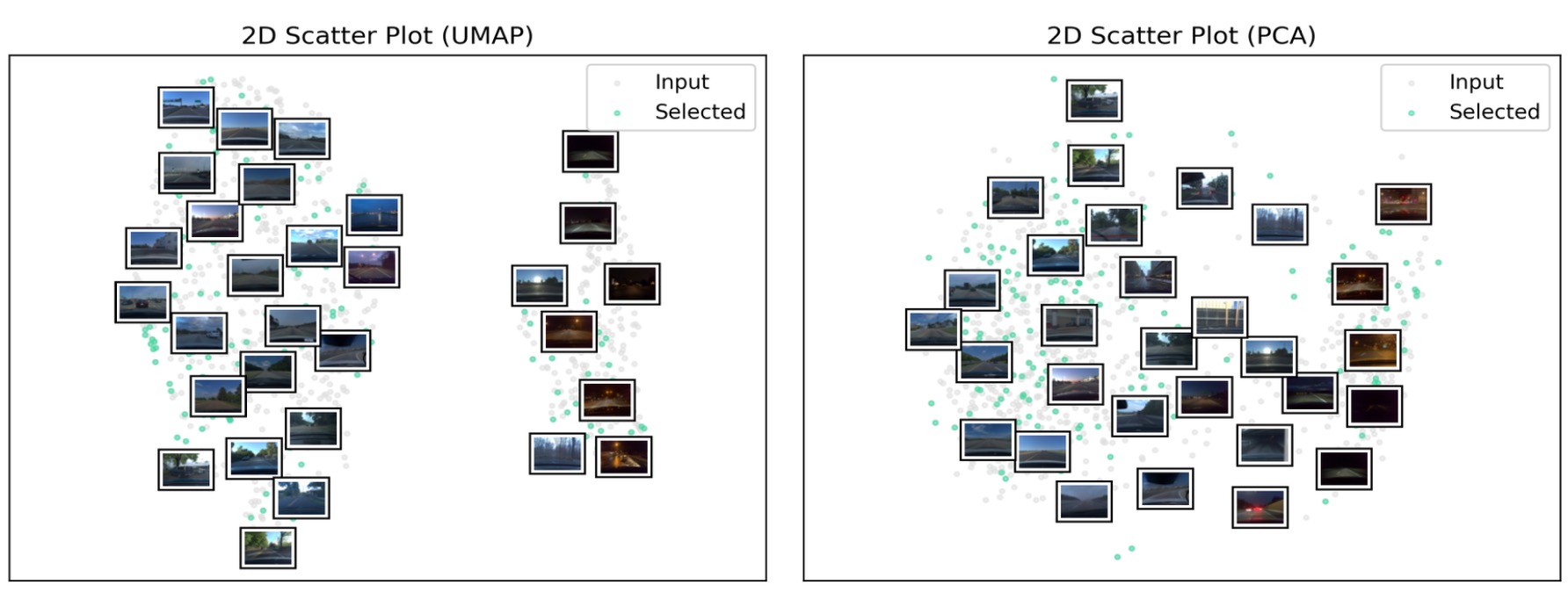
Two-dimensional scatter plots help to understand the distribution of the data and may enable quick insights about outlier cases, dataset bias, or class imbalances.
In this example, the scatter plots show that the dataset contains two clusters, one for daytime and one for nighttime conditions, making the lighting condition an important feature for distinguishing images.
Embedding Diversity Metric
Embeddings capture properties of images by a representation in an Euclidean space. Thus the distance of the embeddings of a pair of images measures the diversity of these images. When training a machine learning model on a set of images, it can help to have diverse images in it, as they help the model generalize better. Conversely, very similar images contain the same information, and training the model on one of them is enough.
LightlyOne measures the diversity of samples within a dataset by computing the distance from each sample to its most similar sample. This distance is the Euclidean distance in the embedding space. The embedding diversity metrics are computed for the input set, selected set, and a random subset of the input set with the same size as the input set. If using a datapool, it is also computed for the datapool and the selected set combined with the datapool.
To understand this metric, consider the graph below, showing input samples (red) and output samples (blue) in a 2-dimensional embedding space. The green lines connect each blue sample to its nearest neighbor. The three metrics are then the mean, minimum, and maximum length of the green lines. The output samples (blue points) were chosen such that the distance between them (length of green lines) was maximized.
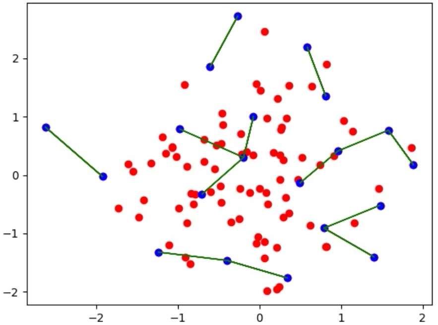
Diversity of output (blue) samples in the embedding space together with the input (red) samples.
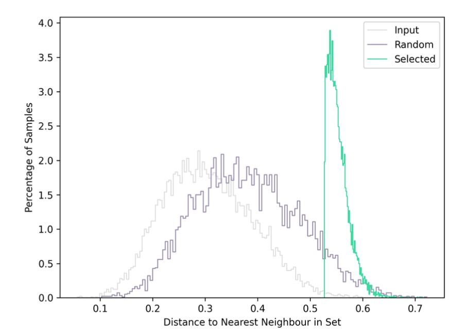
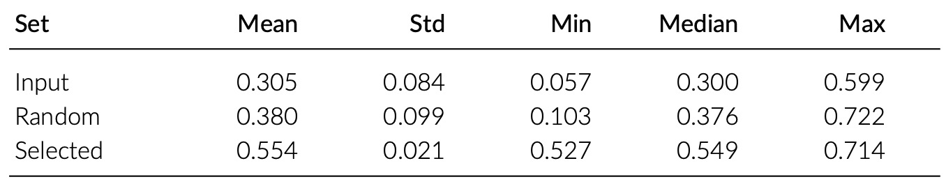
The distribution of distances is computed in the full (usually 32-dimensional) embedding space. The histogram of the distribution is shown as plot in the report, together with a table for the metrics.
In this example, it is visible that there is a much higher diversity in the set selected by LightlyOne than in the input and random set. Thus the effect of using the LightlyOne selection is directly visible.
Embedding Coverage Distance Metric
The embedding coverage metric measures how well the output set covers the samples in the input set. More precisely, the distance from each sample in the input to its closest sample in the output is computed. If these distances are low, it means that every input sample is covered by similar samples in the output.
The coverage distance is mathematically proven to upper-bound the difference in model performance between training on the input and selected dataset under certain circumstances. For reference of the proof: See Theorem 1 of Sener & Saravese, 2017.
Thus minimizing this metric allows you to train the model on the smaller output set and thus with much less labeling and training effort while still having similar performance to a model trained on the entire input dataset.
To visualize this metric, consider the graph below, showing input samples (red) and output samples (blue) in a 2-dimensional embedding space. The black lines connect each input (red) sample to its closest output (blue) neighbor. The two metrics computed are the mean and maximum length of the black lines. Intuitively, these lengths should be minimized. The output samples (blue points) were chosen such that their coverage of the input samples (red points) was optimized.
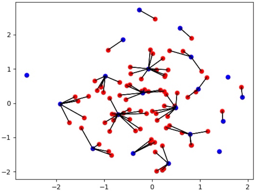
Coverage of input (red) samples by output (blue) samples measured as the distance of each input sample to its closest output neighbour (black lines).
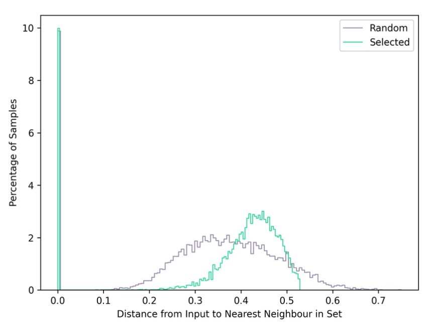
The distribution of distances is computed in the full (usually 32-dimensional) embedding space. The histogram of the distribution is shown as plotted in the report, together with a table for the metrics.
In this example, it is visible that the random selection has a long-tail distribution, which means that many samples in the input set don't have any close neighbors in the random set. Thus there is the risk that a model on the random set won't perform well on these edge cases.
Updated 11 months ago